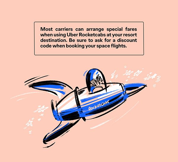
Space Travel Inforgraphic Design
The brief
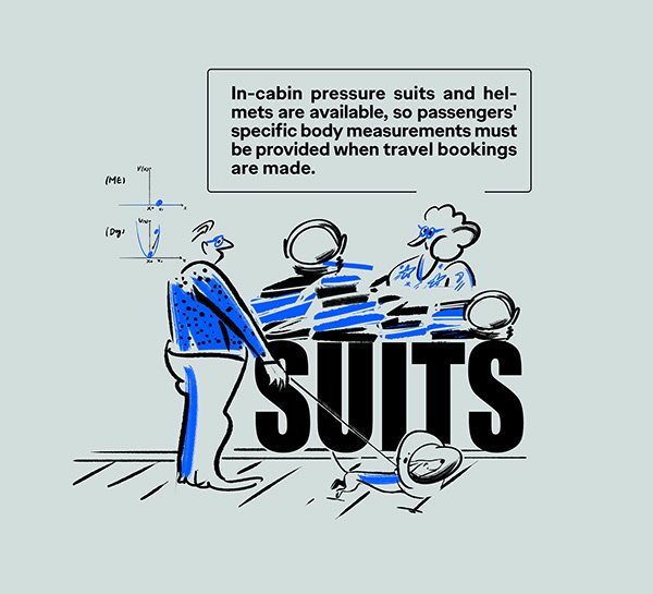
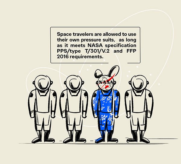
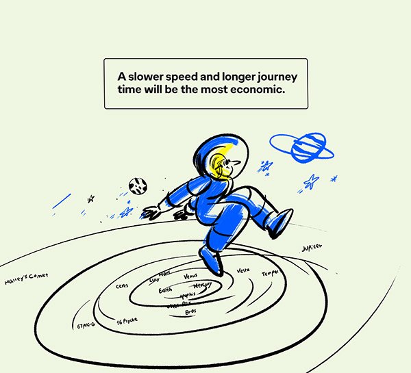
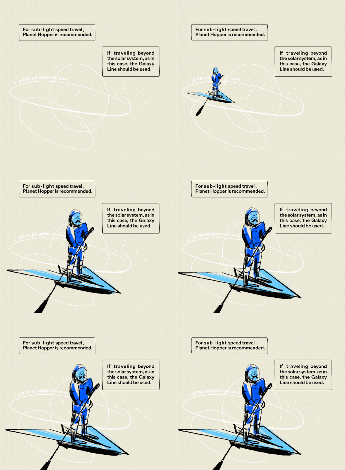
At the beginning of the project, I read through the brief, clarifying the information hierarchy, summarising the nine key messages, and reworking the sentences for any grammatical and syntactical errors I could find.
What should space travel be like?
It’s a trip… just a bit far.
The concept
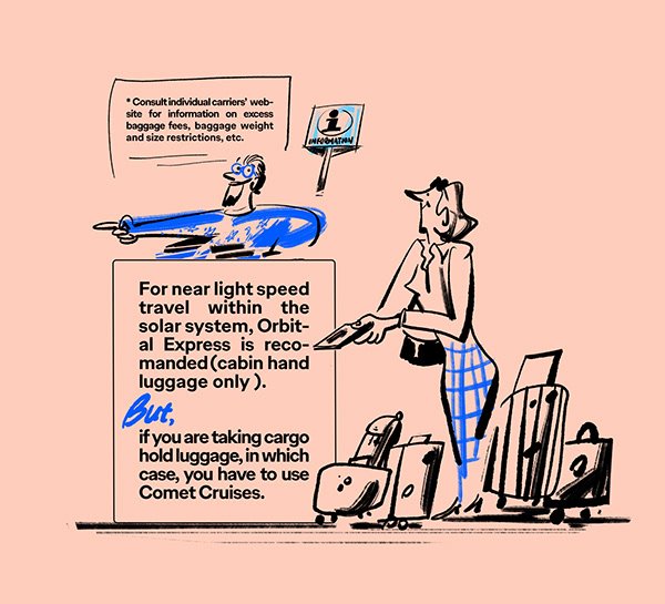
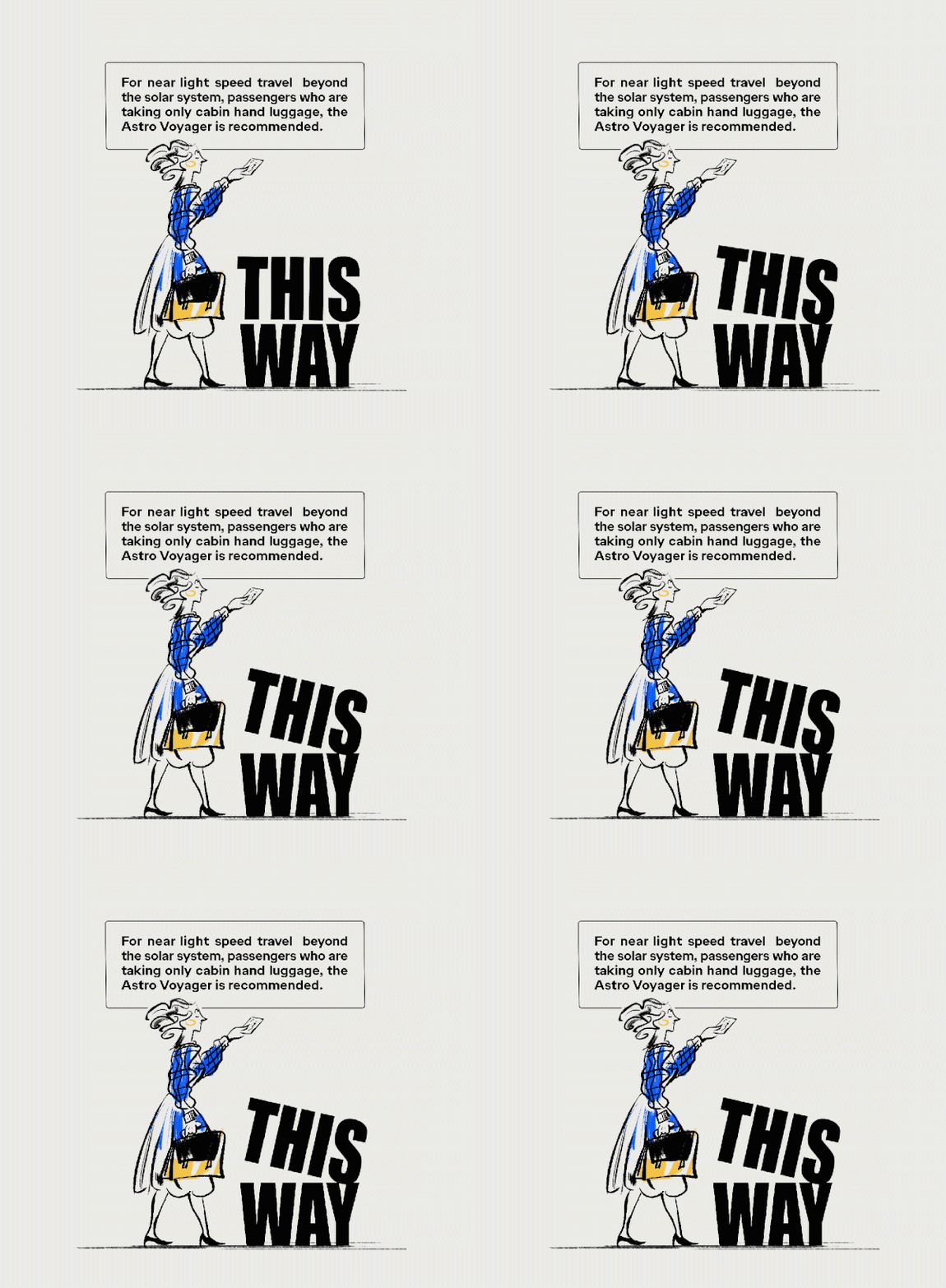
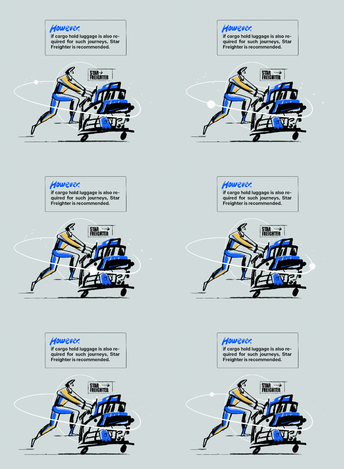
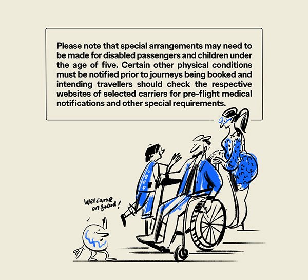
Even though we dealt with a space travel topic, I do think that the essence of tourism has never changed. So our task became how to do our infographic in a lighthearted, easy-to-understand manner. I firmly believe that space travel as a term was understood by our target audience, so we don't have to keep reinforcing dark blue, dark purple, the untouchable universe or technology, and rationality repeatedly in our design.
What I wanted to do was to inject more humanity into the design and communicate in a witty way. Don’t take ourselves too seriously, please.
What I wanted to achieve is:
Modern / Fresh / Stylish / Easy-to-understand / Relaxing / Clean and clear / Fun / Human touch / Heavily connected to life experiences
Type
Infographic/Illustration
Client
King’s College London
Year
2023
It’s a trip… just a bit far.
It’s a trip… just a bit far.
